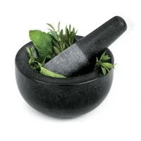
I realized yesterday that I have yet to post another meandering note about the items that have made cooking, rather than a chore, an even pleasurable pastime. Back in April, I chatted on about the glorious world of cast iron. The last few weeks, I've come to recognize my dependency upon yet another small but essential kitchen object: the mortar and pestle. You see, our small one met its demise in our dish rack (or should I say "out" of our dish rack), when it fell to its breaking point on the kitchen floor. We went for weeks without replacing it, which turned out to be quite difficult, as I became acutely aware of how much I actually used this damn thing. This came as a bit of a surprise, since, like many, I grew up with ground spices in the cupboard and ground garlic or ginger (if we had any) in the fridge. When I met Nalin, I soon realized that much of the delight of cooking was grinding fresh spices (not necessarily for every meal, but perhaps after two or three, having ground enough to last for a few preparations). I was soon hooked. I had never had guacamole so wonderful, as when the smoking ground cumin was added to the bowl. Why smoking? Well, it is a lot easier to grind the spice seed if you roast it a bit in a pan and then grind it. The flavor is also remarkable. If you've never experienced freshly roasted and ground coriander, you might just be missing out on one of the great sensory experiences. Okay, so now I'm sounding a bit nerdy. But it is true. After about a week without my mortar and pestle, I found myself at Trader Joe's buying ground cumin and other pre-ground spices. Interestingly, I could definitely tell the difference in my food. Not only that, I also seem to rely on it for pounding ginger or lemon for tea, for crushing fresh herbs, even for making some pastes.
So we finally started researching to get the perfect(ly reasonable) mortar and pestle and came across this beauty from Fresco. We knew we wanted granite but also knew that we needed the inner surface of the mortar and the end of the pestle to be a bit rough as opposed to the smooth exterior to aid the grinding process. Cook's Illustrated had some great recommendations, which led us to this, especially since we didn't want to spend quite so much money (this one was around $30). I love the simplicity of design and functionality. We've used it now for a couple of days and are quite happy. Things seem back to relative normal. I've been able to add the right amount of spice to the right dish, without overwhelming it or mixing too many things together. The very nature of this "primitive" practice creates a more tangible response to the spice or herb, which I believe helps me judge its appropriateness to the food at hand.
So what does this have to do with typography? Well, lately I have been reading a book I got for Christmas entitled Just My Type: a book about fonts by Simon Garfield. Thank you, Janette! Which, as its Amazon description states, asks the question about what your favorite font says about you. Early on, there is a passage that I couldn't help comparing to the idea of cooking and food, especially with respect to spicing. You see, spice is a tricky thing. You can do it too much, too little, pair it unwisely, etc. It is something that I struggle with on a daily basis and ultimately end up using the same old spices in the same old way. As a graphic designer over the last several years, I found that typography was similarly something that could be extremely tantalizing and exciting, but if used incorrectly, could be a disaster. Oftentimes, the answer was to be safe (which could also prove quite boring). Beatrice Warde, friend/lover of Eric Gill (Gill Sans, anyone?) wrote extensively and sometimes provocatively on type in the leading design journal of the time, The Fleuron (back in the 1920s and 30s). Here is what Garfield writes about Ms. Warde:
Her simple and sound theory was that the best type existed merely to communicate an idea. It was not there to be noticed, much less admired. The more a reader becomes aware of a typeface or a layout on a page, the worse that typography is. Her wine analogy was cool and mature, and perhaps now appears a little trite: the clearer the glass, the more its contents could be appreciated...
I don't completely agree with Ms. Warde, but I admire her belief. After all, I like a well-placed, even wild and consuming font as much as the next guy: if it has a solid purpose beyond just using it for the sake of using it. And I'm afraid that goes with spicing as well. Too much of anything can be a pretty bad thing — ruining what could have been so inviting. But one should not be afraid of creativity. Knowing one's subject and being open to new ideas can dramatically change the outcome. Thank god for tools that help us in our daily dalliances. For whatever our mode of communication or creation, an awareness of the broader impact is largely key. And energizing all our senses is a start.
